Design Inspiration
Chat UI design examples
Chat UI is more and more popular in our daily lives. More and more teams, designers and developers are working hard on chat UI design to improve user experience and make chat UI more interactive. On this page, we will share a curated collection of chat UI designed by some best talents from the world to inspire you and spark new ideas for your design process.
We curate topical collections around design to inspire you in the design process.
This constantly-updated list featuring what find on the always-fresh Muzli inventory.
Last update: 11/9/2025
Post-chat UI
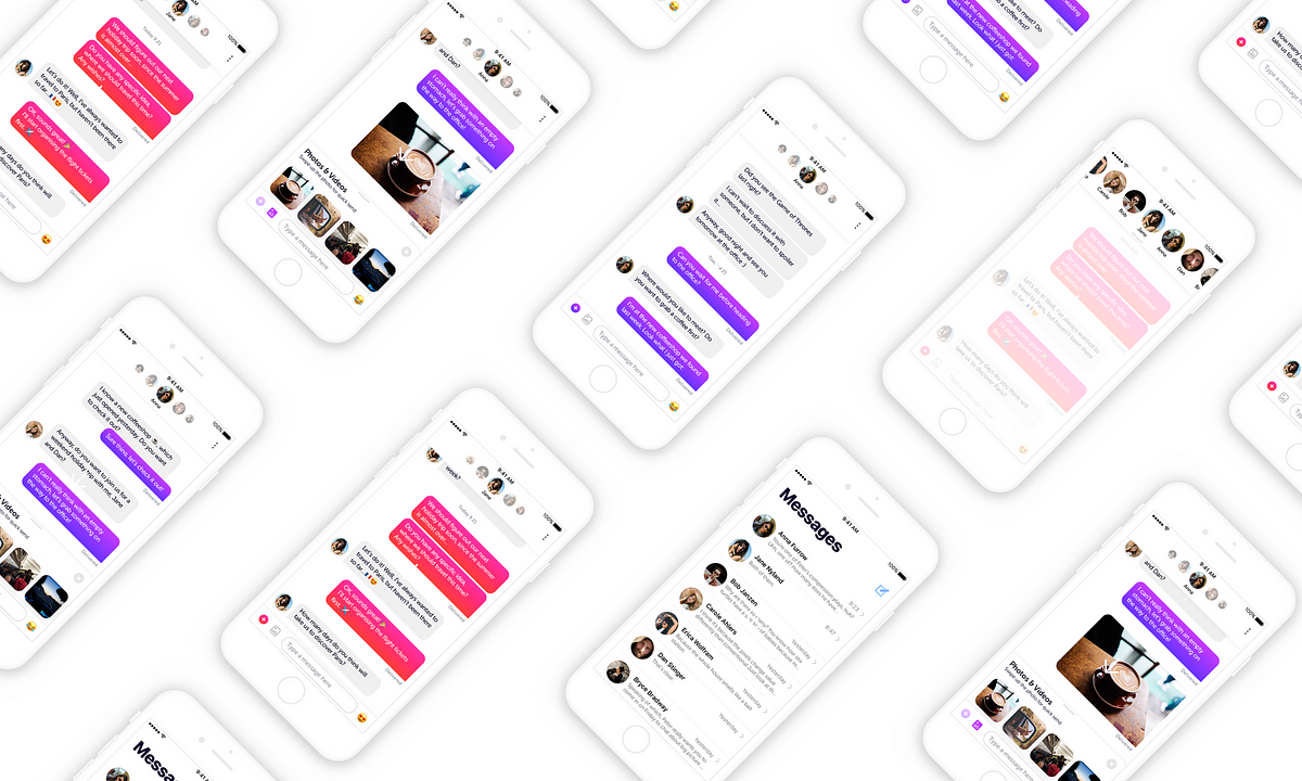
Parallel Chat - UI/UX case study of a new chat interaction
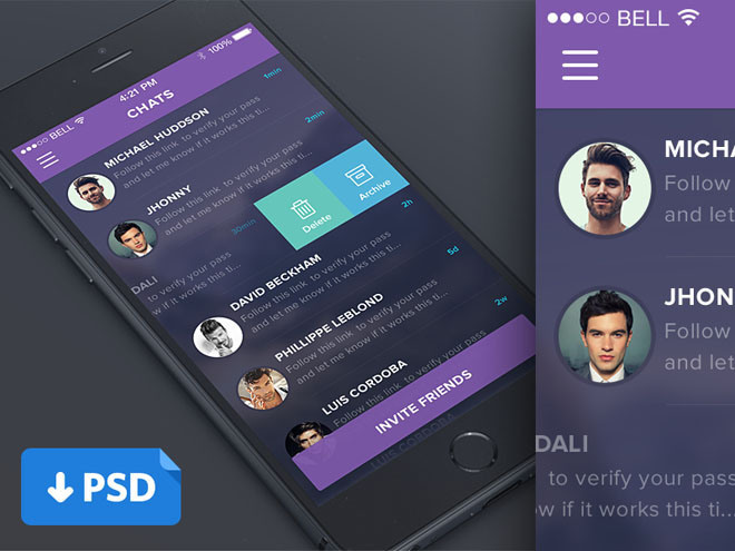
Chat App UI PSD

300 UI in 300 Days — Day 9: In chat group buy design concept

AI chat bot UI

UI KIT - Mobile AI Chat bot
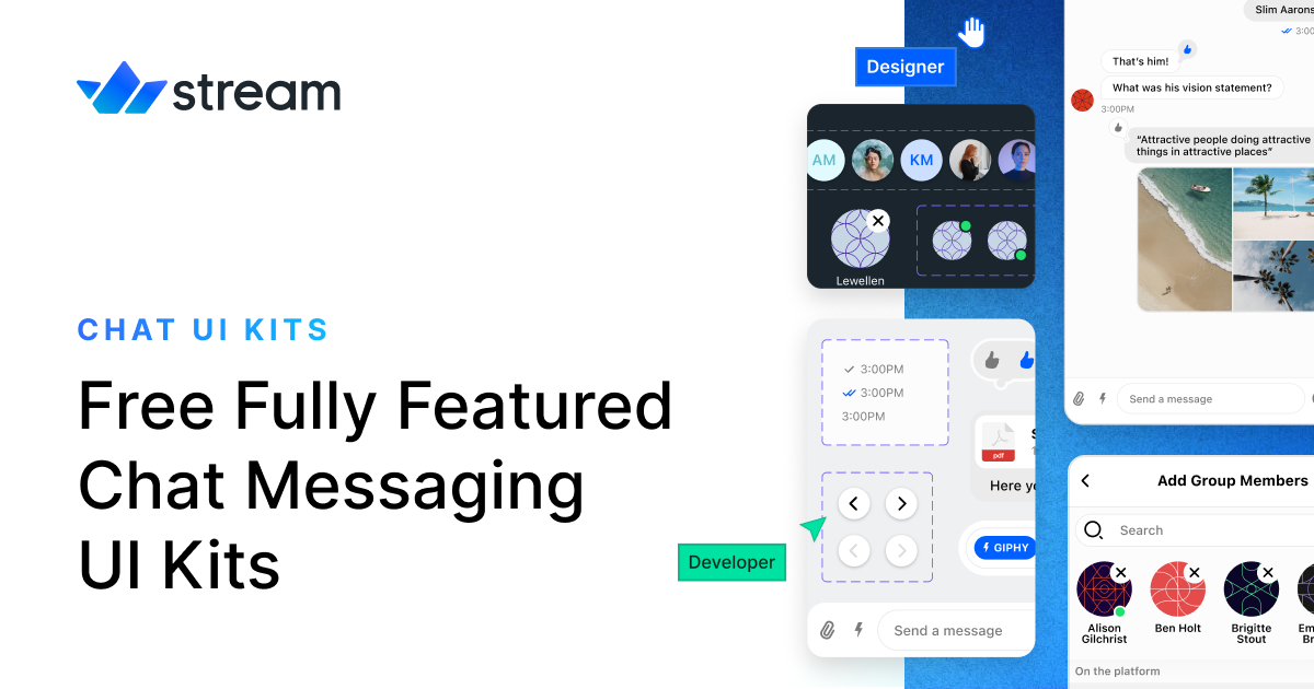
Free Chat/Messaging UI Kits for Your Website or App

Artin - AI Chat Dashboard UI Kit

AI chat bot UI
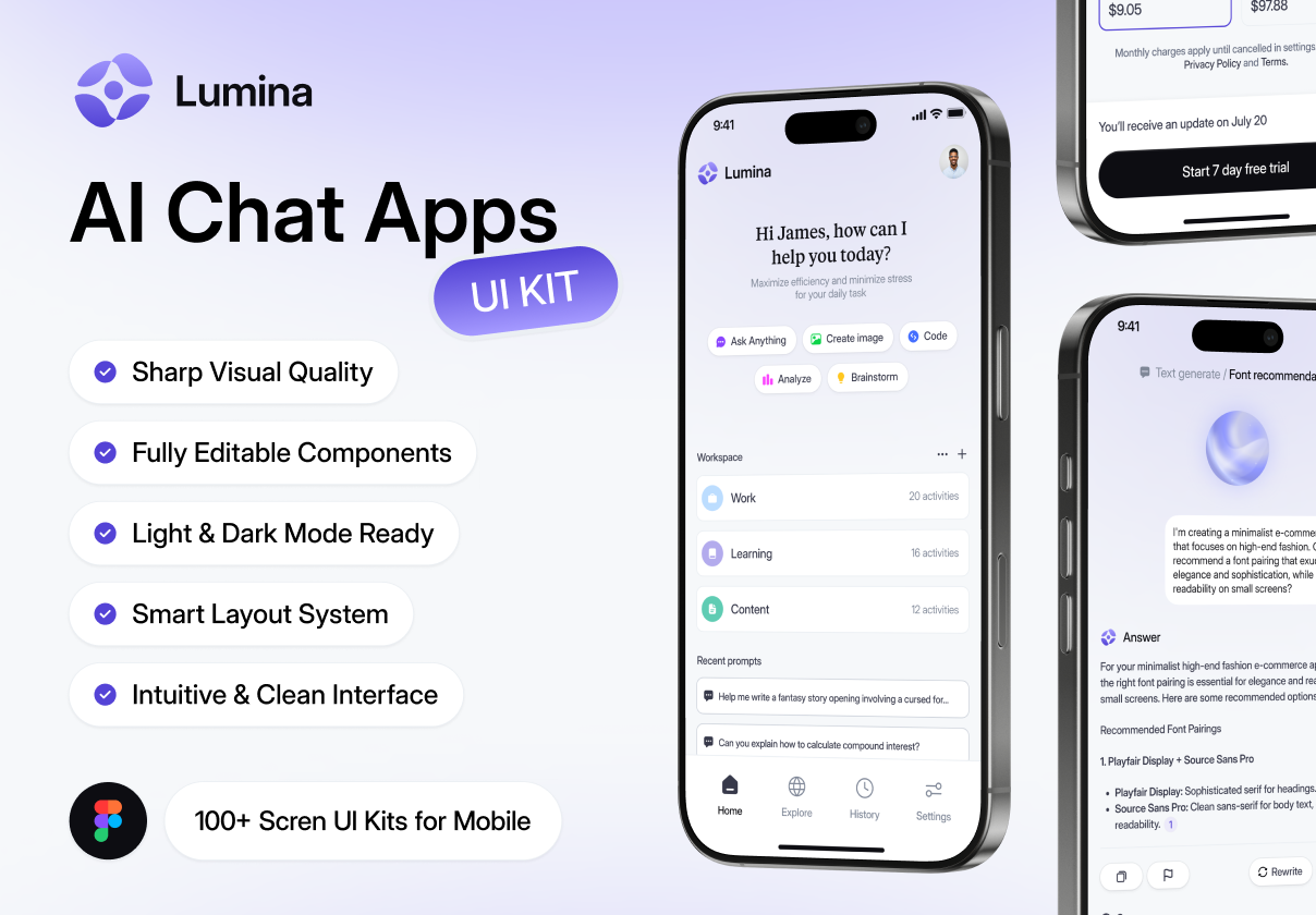
Lumina - AI Chat Apps UI KIT
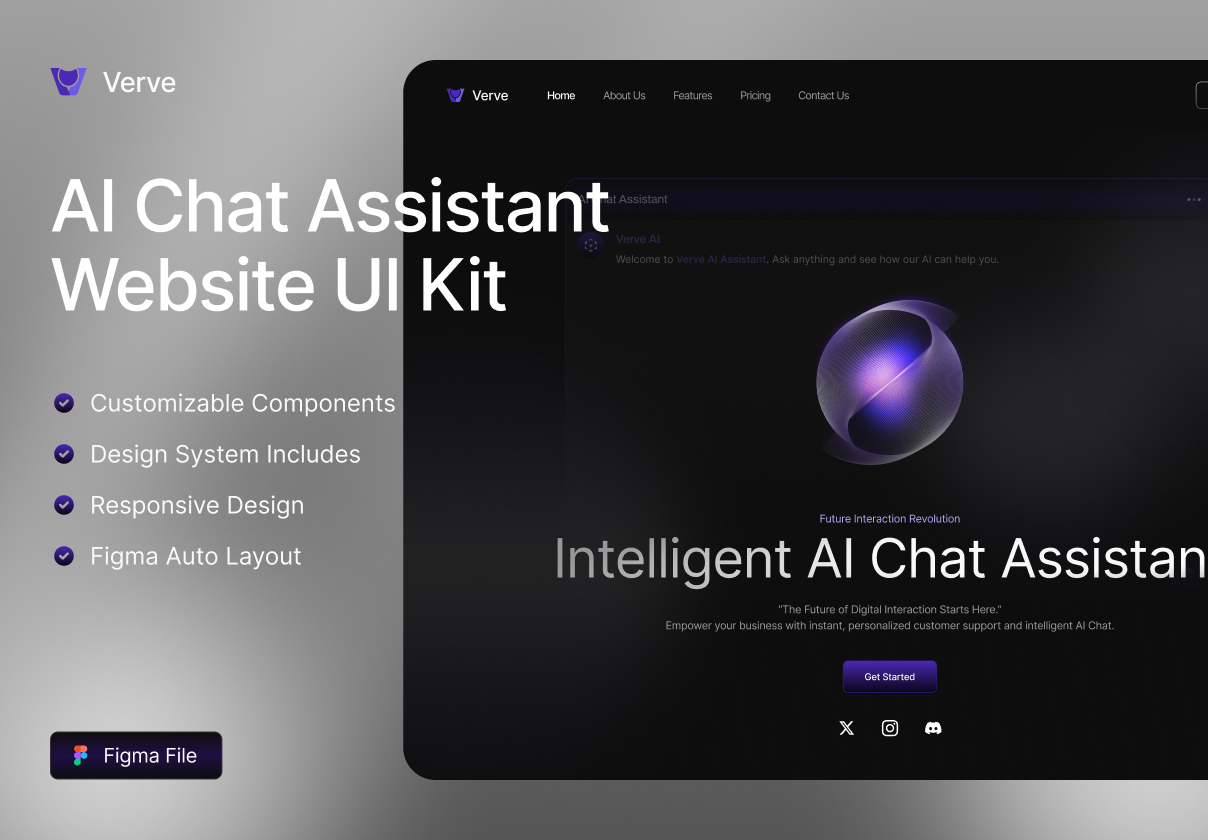
AI Chat Assistant Website UI Kit

ChatHub - AI Chat Mobile App UI KIT

Mindmate - AI Chat BOT App UI KIT

Versacc - AI Chat Mobile App UI KIT

Chat System UI
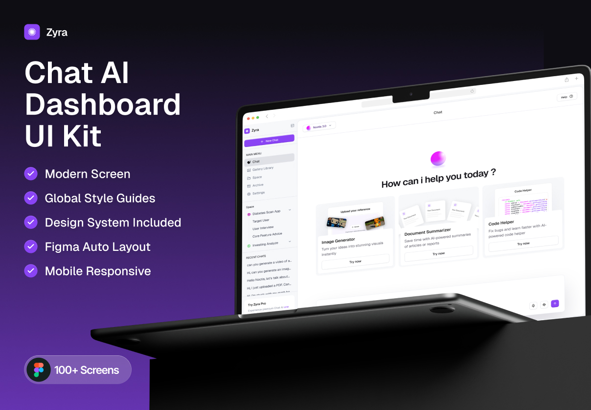
Zyra – Chat AI Dashboard UI Kit

Chitzy - Chat Messenger Mobile App UI Kit

Ai chat pro | AI Chatbot UI Kit | ai Chatgpt

ChatCore | AI Chat BOT App UI KIT

Chat Messaging UI Kit for Sketch
ChatCore | AI Chat BOT App UI KIT

Chatterfly - Chat App UI Kit Template
Chat Ticket UI UX Teams UI UX
Kuest Chat UI Excellence
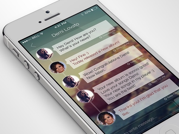
iPhone Chat App #dribbble #ux #ramotion #ios7 #design #application #ui #iphone #behance #app #inteface #gui

Voichouse - Audio Chat Mobile App UI KIT
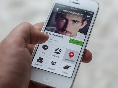
close profile #green #gallery #white #red #chat #ui #location #friends #buttons

Sleek & Modern AI Chat Mobile App UI

ChatAI - Chat GPT App Figma UI Kit

Chat Screen - UI

AI Chat Robot App UI kit - Chatter Bot
3D Illustration for Login Page ARTIN AI Chat Dashboard UI Kit
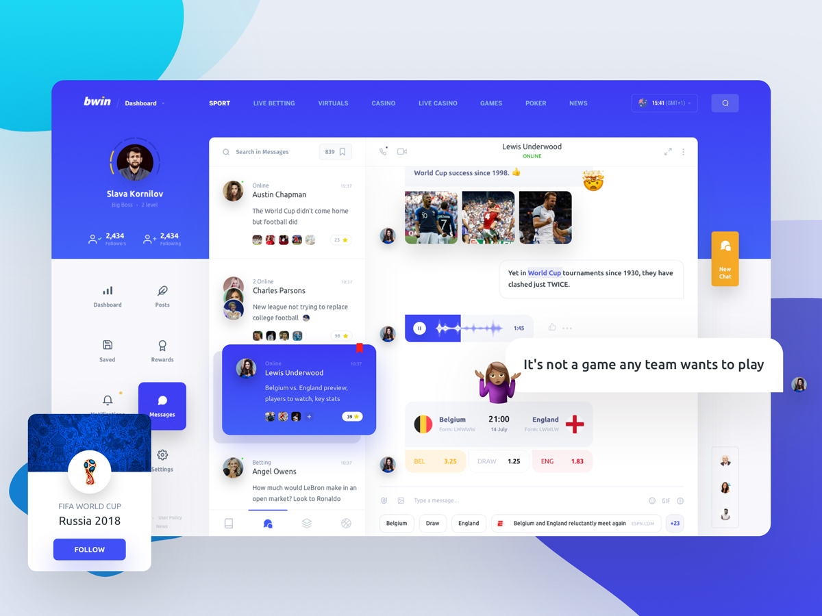
UI Inspiration: This week's selections from Slava Kornilov, Hristo Hristov and more
UI Inspiration: This week's selections from Slava Kornilov, Hristo Hristov and more AoiroStudio Jul 16, 2018 It's that time of the week for our collection of UI/UX interactions to boost your UI inspiration. We are focusing on cool animations, layout designs, UX thinking and more. We are mixing it all from static, dynamic and even live prototypes, this might be a great weekly series to bookmark! This week, we are kicking it off with a very cool combination of colours and UI components designed by Slava Kornilov. You should check out another intuitive UI transition by Ning xiao dong about a Wallet App page. Hope this will give you some inspiration! In this collection we are featuring the work from Slava Kornilov, Hristo Hristov, Adam Przybylski, Shaban Iddrisu™ and more. More Links For more, check out Dribbble Follow my tweets @aoirostudio Follow my pictures on Instagram via Dribbble Design by Slava Kornilov Design by Hristo Hristov Design by Adam Przybylski Design by Shaban Iddrisu™ Design by Yuanxu Design by Robert Felizardo Design by Ning xiao dong Design by Abdullah Un Noman Design by Veera Design by QiYang Design by Aleksandr Lunev Design by Netflayo Design by JUST Team Design by Josh Parenti Design by Christian Puga Design by Boja Design by Graphic Assets Design by Alexandr Kotelevets Design by Sunil kumar Design by Yolanda ju Design by Prometheus x GTR Design by Shekh Al Raihan ✪ Design by JONDesigner Design by Giga Tamarashvili Design by Zahidul Design by Divan Raj ui inspiration UI/UX ui design interaction design

2019 Biggest UI Design Trend
2019 Biggest UI Design Trend abduzeedoJun 20, 2019 So we have a new UI design trend all over us and it deserves a post here on ABDZ. It’s quite clear to notice it, just spend some time on Dribbble and you will spot it right away. This post is literally from three or for Dribbble pages of beautiful mocks. The interesting thing, and what drove me to write this post was when I saw the new Facebook product called Calibra. It features all the same UI patterns, rounded corners that in some way match the phone and screen rounded corners. My interpretation is that as phones become bezeless the screens now match the hardware form, so the software follows the same direction. Apple and Samsung have been exploring this for quite a bit, but now it seems to be all over the place. Anyways, enough talk and here is a collection of designs with the new super rounded corner widgets. UI Design Trends
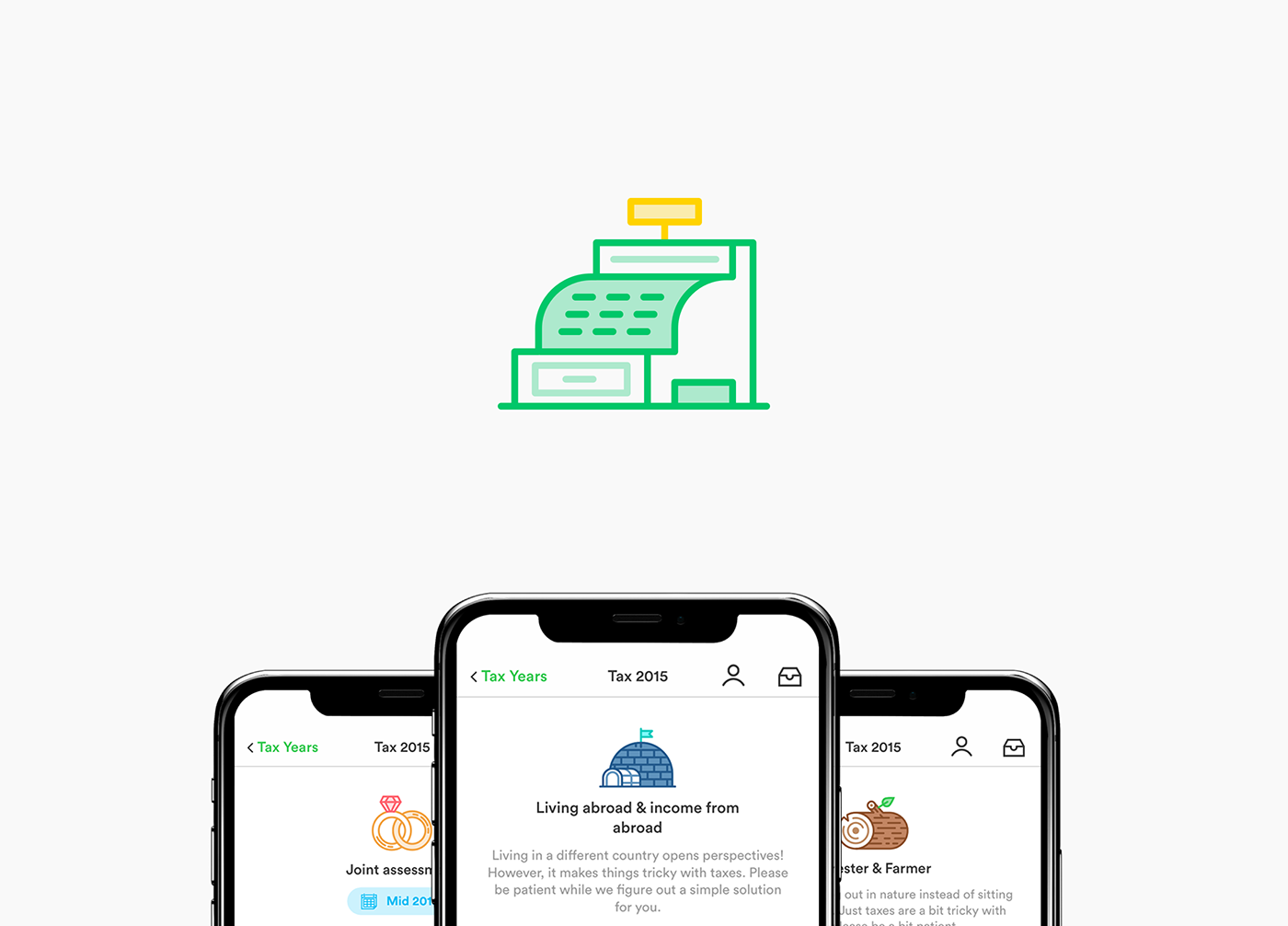
taxfix :: app for tax declarations
PIXEL-PERFECT ICON SET FOR TAXFIX – Taxfix made tax declarations not just easy but actually fun. The Berlin based company combined a chat-like questionnaire with icons and progress driven animations. The app is available for iOS and Android and lets you do your taxes of the last 4 years. The download is free of charge, only if you are getting a tax refund and decide to send to the tax office, they'll charge you a fix amount. Since 2017, beside some help for the UI, my main focus is illustrating icons for the different usages of the app. The two most prominent ones, are the one for the questionnaire and the different tax exemptions.
Meet Velocity: a UI kit and complete design system by InVision
Meet Velocity: a UI kit and complete design system by InVision AoiroStudioJan 10, 2019 Our friends from InVision is introducing Velocity, a UI kit and complete design system. With more than 300 UI elements, 70+ components and 30 screens; a complete designed kit perfect for building Saas apps or/and for your next design system (Such a trendy term lately!). Available for InVision Studio, Sketch and Photoshop. Again, it's free! Get it now. In their words Designers working on a responsive web experience need to design across small, medium, and large screen sizes to understand how each component should behave in different scenarios. But not all UI kits support that. The best results in design come when you think about the form and function components have across an app ecosystem. Velocity will take care of that for you—and set you up for a scalable source of design truth. This dashboard UI kit is a best-in-class example of how to set up a design system. Take your time, dig deep, and learn how you can apply these ideas to your next project. Understanding how shared components make up a design system will speed up your next project. We know Velocity isn’t a real company, but it could be. This kit includes 10 core layouts with the following templates: Dashboard Home Analytics Vehicles Dashboard Service Reminders Map Chat User Profile Settings Sign In Sign up Beep beep. Meet Velocity, a UI kit and complete design system for an imaginary self-driving car company. Borrow, remix, and remake for your own app. Meet Velocity More Links Get Velocity now Get Velocity now

Website Inspiration: Endless
Conversational One Pager (built with Framer) promoting the Endless design subscription by Daryl Ginn. Neat touches making the work section UI elements interactive, breaking down the how-it-works as a real project conversation and ending with a footer chat-style suggestion to head back to the pricing plans. Full Review
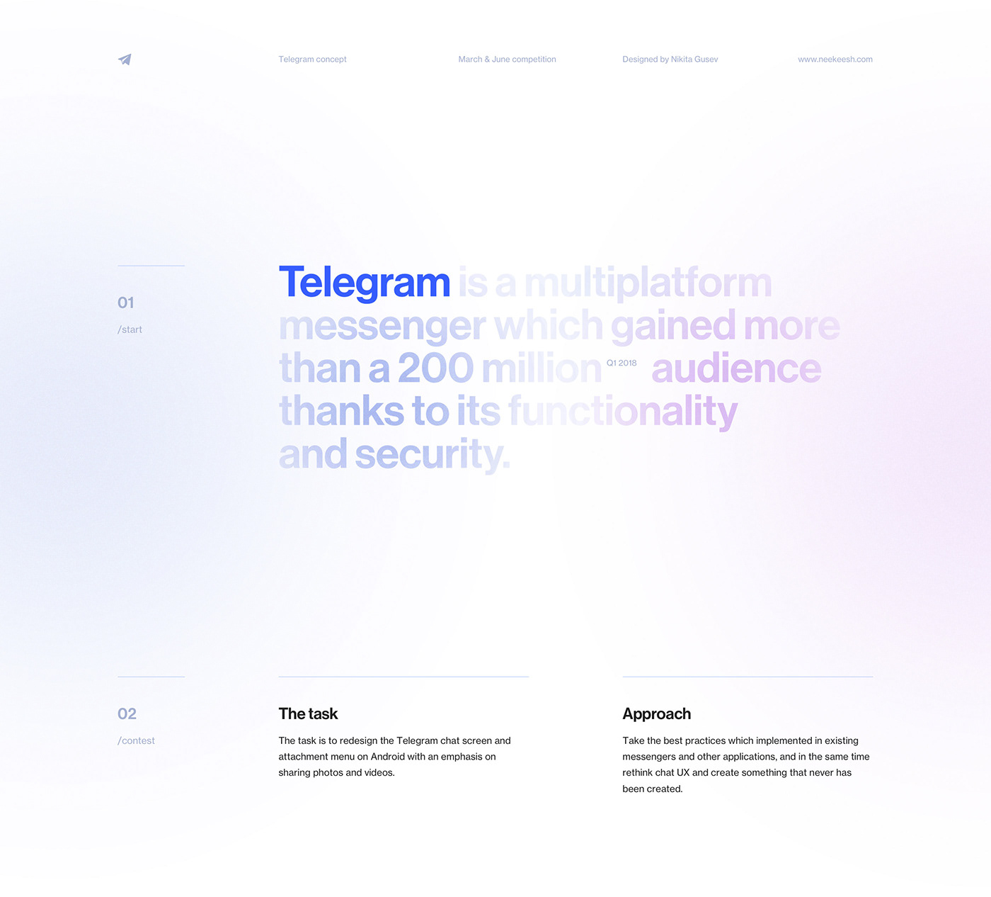
The Future Of Telegram
The first task was to redesign the Telegram chat screen and attachment menu on Android with an emphasis on sharing photos and videos. The second task was to create UI visualizations of voice calls on Telegram. Expected UI animations should demonstrate how a user starts, accepts and ends voice calls.

D-ID - Create professional videos powered by AI
Weekly Designers Update #530
Your weekly dose of design inspiration, featuring the hottest projects, must-have tools, and game-changing products.Looking for more daily inspiration?Download Muzli extension, your go-to source for design inspiration!🏆 Muzli Community UploadsWant to get featured? Upload your work to Muzli.meTweet by Slavaby Kornilov SlavaAI Board Work Tasks🔗 View the project.Animal Futuresby Unseen StudioExplore five immersive worlds, each showing a different future for animals, and learn how your choices impact their well-being.🔗 View the project.Brand Design for an AI-Driven Learning Platformby ZajnoWhile working on the visual identity for Gentle Rain, we drew inspiration from the early days of technology and entertainment — when hip hop, the movie industry, and personal computing were just emerging on the U.S. West Coast…🔗 View the project.Hand-Thrown Stonewareby Quang PhanA study of clay, light, and balance — translated into pixels. Inspired by Hanoia, this concept celebrates the quiet beauty of handcrafted stoneware.🔗 View the project.🔥 Must-See Design PicksOusmane Dembélé — Ballon d’Orby Flot Noir ™ ⏤ StudioOusmane Dembélé, from the streets to legend. A digital & immersive experience celebrating his Ballon d’Or under the colors of PSG….🔗 View the project.Michaël Bernardby Michael BernardDesigner passionné par la création d’expériences digitales sur-mesure, j’adopte une approche centrée sur l’émotion pour concevoir des projets sincères et authentiques.🔗 View the project.VAP — Video Production Studioby Studio 9PVideo post-production for brands & influencers: VAP creates impactful, original, and memorable content. Cam ON, it’s time to .mov your stories.🔗 View the project.Morphon Iconsby JAVIERMorphon Icons is a full revamp of one of my favorite icon sets, originally designed in 2017. This personal project reimagines that old work through a refreshing modern lens, introducing soft neumorphic styling, smooth motion baselines, and practical demo cases, all optimized for community use and open remixing.🔗 View the project.✨ Muzli Me — Creator SpotlightZajno Digital Design Studio is a creative digital studio known for crafting striking and memorable experiences across web, motion, and branding. Their work stands out for its refined aesthetics, strong storytelling, and attention to detail.🔗 Explore their work: https://me.muz.li/zajno.💡 New Tools & Assets for DesignersCanva UpdatesCanva introduced its biggest launch yet: the Creative Operating System, marking what it calls the Imagination Era. The update unites a redesigned Visual Suite, world-first design AI, and tools for scaling brands. Highlights include Video 2.0 for advanced editing, Canva Forms for interactive sites, Canva Grow for AI-powered marketing, and the integration of Affinity, now free for everyone. The new Canva Design Model brings editable, AI-generated designs that understand layout, hierarchy, and brand style.🔗 Explore this.Figma UpdatesAt Schema 2025, Figma introduced a new generation of design system tools built for the AI era. Highlights include Extended Collections for managing multi-brand systems, Slots for flexible component customization, and a faster design system engine with major performance gains. Figma also released an improved Code Connect UI, the MCP server for linking design and code, and Make kits that bring design systems directly into Figma Make. These updates push design systems toward smarter, living frameworks that evolve with AI-driven workflows.🔗 Explore this.Framer Halloween CampaignFramer hosted a fun virtual “Halloween Office Party” showcasing team members in creative AI-generated costumes, all displayed on a slick interactive gallery built with Framer. The project invited the community to join in by posting their own costume photos using the #FramerHalloweenParty hashtag, turning a simple holiday celebration into a visually engaging brand experience that highlights Framer’s design and web-building capabilities.🔗 Explore this….Ängelholm — Design & Brand GuidelinesModern Brand Guidelines Template🔗 Explore this.Zyra — Coded Chat AI DashboardModern AI chat dashboard built in React and Tailwind🔗 Explore this……💡 Stay inspired every day with Muzli!Follow us for a daily stream of design, creativity, and innovation.Linkedin | Instagram | TwitterWeekly Designers Update #530 was originally published in Muzli - Design Inspiration on Medium, where people are continuing the conversation by highlighting and responding to this story.
Facebook desktop app, Mr. Robot, Art and more… Weekly inspiration roundup!

Ernest - Your Financial Wellness Coach

Weekly Designers Update #434
via Muzli design inspirationLooking for more daily inspiration?Download Muzli extension — your go-to source for design inspiration!Web design inspirationAll Around Us* Environment Explorer Collection AW 2023Portfolio for AAU product design graduates.Minimalistic, grayscale color scheme, storytelling layout, interactive elements, non-traditional typography..ButtermaxOnline store for a footwear brand.Monochrome palette, product-centric layout, bold typography, simple navigation, photographic elements..KidSuper WorldDigital platform showcasing KidSuper’s creative universe.Surrealism-inspired, vibrant colors, animated elements, interactive layout, playful typography..Oovra | Dedicated Sales & Support For Professional ArtistsWebsite for a sound licensing and music curation company.Elegant, monochrome design, dynamic layout, audio-visual interactivity, classy typography..Design ResourcesInteriorry — Interior design Webflow Website TemplateInteriorry is a Webflow template for Architecture and Construction Companies, Interior Design Studios and Architecture Studios with modern design. Perfect for growing your business..Gilbbert — Portfolio Webflow Website TemplateIntroducing Gilbbert — a modern Webflow template designed for designers who want to showcase their work through a portfolio website with a touch of aesthetic minimalism and sophistication..Moore — One Page Webflow Website TemplateMoore is a professional template for agencies, startups and consultancies. With a strong focus on clean aesthetics and smooth interactions it serves as the perfect foundation for showcasing your business in an appealing way..TEasy Todo: TaskList & Calendar App UI KitEasy Todo: TaskList & Calendar App UI Kit we design in Figma.Laptop Office Desk MockupEditable PSD Mockups of Laptop Screens on Office Desk.SmartBot — Saas WebsiteSmartBot is a powerful Framer template for AI-powered products, seamlessly enhancing your startup or SaaS offering. Unlock the potential of AI with this powerful template..Product SpotlightAI Logo Designer — Ai MagicxCraft distinctive and personalized logos without depending on stock designs. Harness the prowess of A.I. to guide every facet of your logo design journey with.Typist — animated typing text for forms and chat UITypist helps make your prototypes look so so real by turning text layers into animated, typing text components. No more super-fake janky forms! Bring that chat interface you’re working on to life!.Uiverse.ioExplore 3000+ Free UI Elements: CSS & Tailwind.FeedbackWizard.aiAI Magic in Figma, at your fingertips — design wisdom applied to your design, in seconds. See the demo at feedbackwizard.ai.Design inspirationDaise — Flower Shop Landing Page Figma Template by Ahmad S. Afandi for Peterdraw StudioFinance Management Dashboard by Bogdan Falin for QClayMolecule — Smart Home Mobile App & UX UI Design by RondesignlabFintech App UI by Ofspace UX/UIDSTT kitchenware Logo | Visual identify | packaging厨具包装 by zwqy .lab and zwqy. LIDINCalligraphy Manuals: Blackletter — Rotunda by 0. itemzero, XESTA STUDIODiscovery Coffee Pack by BANG BANGOIOLAB® by HUGMUN Life Stills by viction:ary .December 6 | Poster 3D by Duong NguynRetro Sneakers | Lettering & illustration by Ana MorenoWeekly Designers Update #434 was originally published in Muzli - Design Inspiration on Medium, where people are continuing the conversation by highlighting and responding to this story.
Redefining Dating Apps — UX/UI Case Study
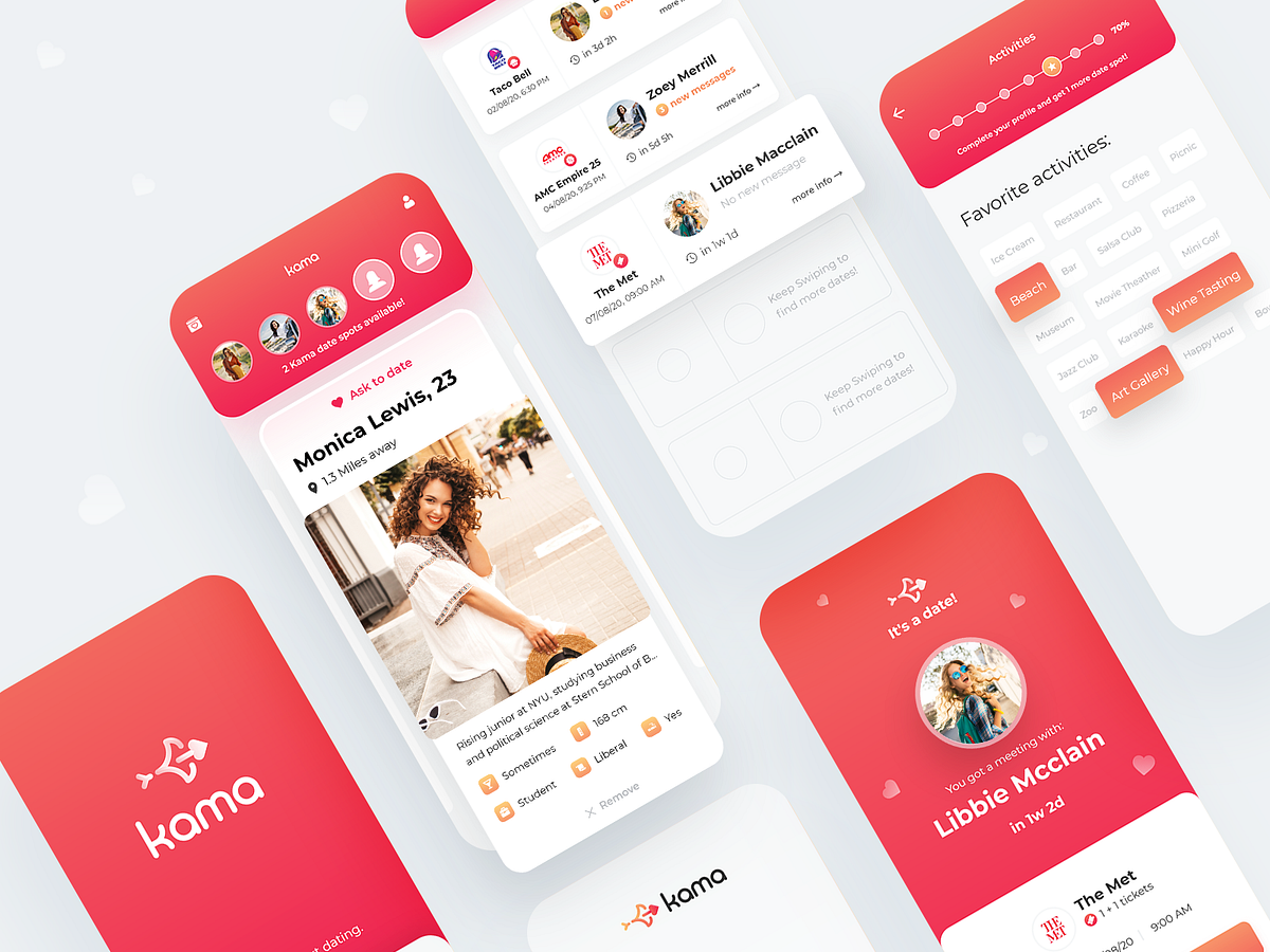
Redefining Dating Apps — UX/UI Case StudyIntroductionToday a lot of dating apps in the market focus on matching users and provide a texting platform. They do so in different ways, but their focus is on providing their users with introductions to each other. As such, those can be described as matching-apps. Their main fault is their matching-dating ratio, which stands on an average of 150:1. As such, people who look for in-person dates might find it hard to achieve those through dating apps.ProblemI formulated precisely the problem that Kama came to solve according to the familiar pattern: who it is about, what they are trying to do, what is actually happening, why it is happening that way and what it makes them feel.Young adults with little free time who are looking to make a romantic relationship try to optimize the time it takes them to find a partner through dating apps. They fail to do that and set up real-world dates because the apps only help to initiate texting conversations and not everyone manages to take it to the physical realm, which makes them feel fatigued and frustrated.ResearchSurveys and InterviewsI started the research phase with surveys. The survey was conducted among 300 single American students. Here are some of the significant data that received:User PersonasBased on the surveys and interviews conducted with several potential users, I formulated two personas:Pain PointAs mentioned, the main problem is the difficulty of turning the matches into dates. For the solution to solve this problem, I summarized the research into 4 main pain points that cause difficulty for the users:Lack of texting skills: Frustration by users who lack texting articulation skills, due to interactions on dating apps built entirely on texting skills.Fear of rejection: Fear of rejection eliminates the chance that one of the individuals will take a step and offer to meet for a date.Swiping without purpose: Since swiping requires no commitment, matching without purpose is very common, leading to a low match-to-date conversion rate.Date’s logistics: Difficulty determining specific place and time. In most cases it ends with: “let’s get drinks some time”.SketchesAt the ideate stage, the main focus was on the main screen. I put a lot of thought into the swiping mechanics, the display of potential profiles to match, the preview of the user’s dates, and more.WireframesAfter the general idea was formulated in the sketchings, I moved on to the wireframes phase. At this point I concentrate only on the functionality and usability of the app when the goal is to create an intuitive experience with as few frictions as possible.BrandingThe design of the screens is derived directly from the company’s branding and since Kama didn’t have one, I was given the responsibility to create it. Kama’s story is very simple: creating real-life relationships easily and quickly, without all the noise that is usually around it.So I chose two main colors: red and yellowish-orange. The red color symbolizes the fact that Kama does not try to be sophisticated, it concentrates on the simple thing — love. The yellowish-orange color and the arrow-shaped symbol gives a sense of fast pace. No nonsense, straight to the point.The origin of the name Kama is in the Hindu god of human love, Kamadeva. According to the stories, he walks around with a bow and arrow like Cupid’s.Final DesignOnboarding FlowIn this section, it is essential to explain what sets this app apart from any other dating app. The user understands that the emphasis is on dating, that he can get discounts and continue to use the app for additional dates.Onboarding screensMain ScreenThis screen is the heart of the app. I put a lot of thought into finding the right pattern that would meet all the needs. At the top in the red rectangle are the Date Spots. The user is limited to 5 dates at a time to increase the importance of choosing the right date. The familiar swiping got a twist and instead of right and left, it is up and down. Dragging the profile up creates a feeling that you are putting moving it to the Date Spots. The profiles appear one by one but unlike other applications — in a horizontal carousel. This means that you don’t have to decide if you approve or reject people and you can continue scrolling. This solves a big problem: once the user runs out of places on the Date Spots, he can no longer swipe profiles up. But what he can do is filtering — swipe down the profiles he didn’t like from the potential profiles list. Once a spot becomes available, the user will be able to swipe up profiles from the remaining once.Main screenIt’s a date!As soon as two people swipe each other up — a date has been set for them! The system automatically and wisely selects the place and time according to each user’s preferences. On the dates screen, it was vital not to make it a regular chat lobby but to give the date much more expression than the texting. Same on the date/chat screen — the details of the date appear first in a big and clear way and only then can you slide up and start chatting.From left to right: matching screen, dates screen, date/chat screenSign UpKama is all about setting the most accurate dates, so the registration process is not short and requires a lot of details. In order not to discourage the user, I’ve added an element of progress that pushes the user to create a perfect profile and fill in all the details. The prize for those who reach 100 percent is an option to increase the dating quota from 4 to 5.Sign up screensConclusionsThe work on the app was fascinating. Although the dating app market is flooded with loads of apps that look the same, Kama brings something different to the table. It allows people to bridge the technological gap and test their connections in real life. Together with the guys from Kama, we carried out an end-to-end process — from understanding the users’ real needs to implementing it in an attractive and thoughtful interface.That’s all for this time, thanks for reading it to the end! If you enjoyed this article please click the clap button or leave a comment below — I would love to hear your feedback (Did you know? You can give up to 50 Claps on an article! Just hold the clap button for a few seconds 😉)Feel free to reach out to me on LinkedIn!You can find more case studies like this on my portfolio: www.nadavpapay.comRedefining Dating Apps — UX/UI Case Study was originally published in Muzli - Design Inspiration on Medium, where people are continuing the conversation by highlighting and responding to this story.
Designing for Dark Mode: More Than Flipping a Switch
Designing the Future of Banking: Actionable UI/UX Tips for Neo Banks
IntroductionWe have all witnessed how the COVID-19 pandemic has accelerated the pace of digital transformation across industries, and banking is no exception. With social distancing measures and lockdowns in place, consumers increasingly turned to digital banking channels to manage their finances. As a result, we’ve seen a surge in the popularity of Neo-banks, which have disrupted traditional banking models by providing a better user experience through innovative UIUX design.Since we have already explained how UIUX design plays a critical role in the success of Neo-banks, in our previous article, we decided to share some of the best UIUX design tips which can help you design a successful Neo-banks platform in this blog.If you’re a UIUX designer working in the Fin-tech industry or a business owner looking to launch a Neo-bank, this article will provide you with a comprehensive overview of the key UIUX design tips you can implement for the success of the neo-banking landscape & share what does the future of UIUX design hold for neo banks.Let’s begin,5 Actionable UI/UX Design Tips for Neo-banks to overcome user experience challenges:Seamless Onboarding: A crucial element of UI/UX Design for Neo BanksThe first impression is the last. The onboarding process is the first and critical step towards building a relationship with a user. So, ensure the process is streamlined and easy for the user.From simple sign-up forms to personalized welcome messages and tutorials, every aspect of the onboarding experience should be designed with the user in mind. This means ensuring that your design is easy to access for people with disabilities, including those who are visually impaired or have limited dexterity.We recommend avoiding the traditional way of authentication, like entering passwords and one-time codes; instead, incorporating technologies like biometric authentication and digital signatures can help make the onboarding process faster and more secure as banking users are low in patience to check or execute their financial transactions.Revolut, for example, uses AI-powered facial recognition technology to verify users’ identities, making the onboarding process a breeze.2. Simplicity is Key: Prioritize a clean and intuitive dashboardPoor UIUX can impact the success of the neo-bank. So, it is wise to focus on the hallmark of neo-banks which is creating a minimalistic design. Start by identifying the user scenarios and use cases, i.e. if the user handles multiple accounts, design an intuitive user journey to switch from one account to another with ease second, and ensure that the important information is always at the user’s fingertips by preserving a mobile-first design approach.For instance, post logging in, any neo-bank customer would like first to check all their critical financial status information upfront, like balances, transactions and so on. Hence thoughtful information architecture, visual hierarchy, effective use of whitespace, designing for smaller screens, touch interactions, and optimizing for speed is vital. Keeping the design simple and user-friendly can reduce user frustration and improve the overall satisfaction of the customer.Monzo is an excellent example of a neo-bank with a simple and intuitive UI design emphasising ease of use.3. Give a personal touch: Tailor the User Experience to boost engagement and loyaltyIn today’s highly competitive Neo-banking landscape, offering a personalized user experience can be a game-changer for boosting engagement and building customer loyalty. By using data analytics and insights, UX designers can create personalized experiences for their users based on their transaction history, location, and other factors. Neo-banks can provide this by incorporating personalized messaging, customized dashboards, and targeted offers and promotions.For example, the N26 platform has a feature that automatically categorizes users’ spending based on their transaction history, making it easier for them to track their spending habits and plan their further expenses accordingly.3. Engage Users with micro-interactions: Include small animations & gamificationBy adding subtle animations, such as a loading spinner or a checkmark when a task is completed, UIUX designers can enhance the user experience and engage users, improving personality and brand identity; however, animations shouldn’t be overwhelming and distracting to users. Gamification, to is an effective way to increase user engagement and create a fun and interactive user experience by incorporating challenges, rewards, and badges.Chime, for example, rewards users with “Chime Coins” for making purchases with their debit cards.4. Provide Real-time Feedback:Real-time feedback is essential for neo-banks to build trust and confidence with their users. Providing real-time feedback on transactions, balances, and other activities can help users feel in control of their finances, reducing the hustle of visiting the bank or waiting till the end of the day for their transaction status update. According to the nudge theory, banking AI context-based suggestions, which are powered by analytics & big data, can provide an amazing customer experience.For this, you can check how Starling Bank provides real-time transaction notifications and balance updates, helping users stay on top of their finances.5. Streamlining Payment Workflows: For Faster Payment ProcessingProviding quick and efficient payment processing is crucial for Neo Banks to stay competitive. With the rise of instant messaging apps and other fast-paced technologies, users expect payments to be processed quickly and seamlessly.UIUX designers can play a key role in improving payment processing times by simplifying the payment process and reducing the required steps. Additionally, integrating with third-party payment providers and leveraging cutting-edge payment technologies can further improve payment processing times. Ultimately, providing payments faster than instant messaging can be a key differentiator for neo-banks, increasing customer satisfaction and loyalty.Future of UIUX Design for Neo BanksThe future of UI/UX design for neo-banks is likely to be influenced by a number of trends, including personalization, voice and chat interfaces, data visualization, security, and seamless integration.As neo-banks continue to grow in popularity and expand their services, UI/UX designers must stay up-to-date with these trends and find new ways to create interfaces that meet the evolving needs of users and the industry.Overall, the focus will be on creating personalized, intuitive, and secure interfaces that provide a seamless experience for users while also leveraging new technologies and data visualization techniques to help users better understand their financial situation. By embracing these trends and staying ahead of the curve, UI/UX designers can help neo-banks continue to innovate and provide value to their customers in the years to come.Conclusion:Neo-banks need to focus on creating a user-friendly and intuitive interface to make a mark in the digital banking space. By following these tips and incorporating real-life examples, neo-banks can create a compelling and engaging user experience that keeps users coming back.Designing the Future of Banking: Actionable UI/UX Tips for Neo Banks was originally published in Muzli - Design Inspiration on Medium, where people are continuing the conversation by highlighting and responding to this story.
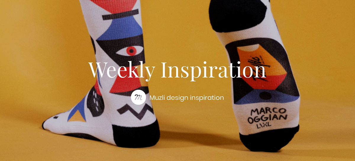
Weekly Design Inspiration #293
via Muzli design inspirationDesign by Marco OggianDesigners’ Secret SourceThe best design inspiration — expertly curated for you.Muzli is a new-tab Chrome extension that instantly delivers relevant design stories and inspiration. Learn moreSocial Chat by AfterglowOptimizer App by Sandro TavartkiladzePill Speaker Website by Halo UI/UXSmart Home Manager App by by Dmitry LauretskySiopp 📦 | Cargo tracking app by Alexander Plyuto 🎲heart by Alexandra ZuttoSunset on Mars (fine glitch art) by Nina GeometrievaCooking with Grandma by Mathieu L.Bhttps://medium.com/media/b124085903eb4c374694d1c91e3c4b0a/hrefGoogle Doodle World Cup in Russia Edition (Part Two) by valsPacific&Co. by Marco OggianCLIENT ERROR 4xx v02 by RETOKAKINSA Organic Skincare by Lara Scarrwhiskey concept by Vadim BriksinSerration Object by found / FoundedWeekly Design Inspiration #293 was originally published in Muzli - Design Inspiration on Medium, where people are continuing the conversation by highlighting and responding to this story.
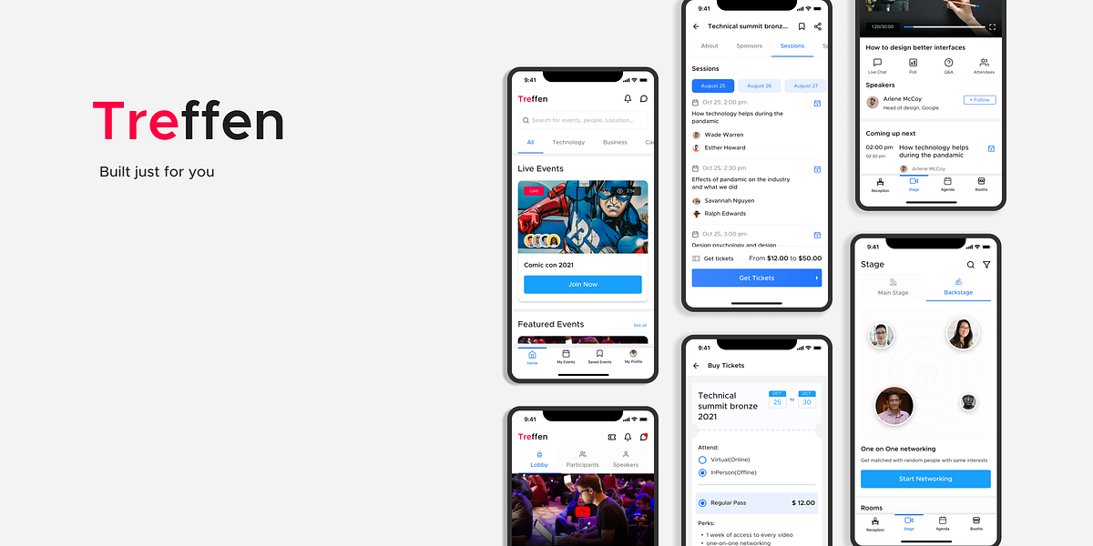
UI/UX case study: Hybrid event platform for mobile.
Detailed documentation of the process and approach that was taken to create this mobile application.Background StoryA few months ago while attending an online event, I met some interesting people with similar interests. After the event ended, it appeared that I can no longer text them. The first thing that came to my mind was “why do I need to move to another platform to stay connected is it good for the app user base?” so naturally I started exploring other online events platforms after a while it was clear that there is almost no such platform exist that has chatting feature after the event has ended not only that I saw a lot of flaws in them, there exist almost no platform that provides hybrid events i.e the event one can attend online as well as offline, not only that there are only a few event apps that exist and only one that has hybrid events. After talking to other people who generally attend events I came across these problems.What is Treffen?Treffen is a hybrid event app that allows users to attain events offline and online simultaneously. The name translates meet up in german.👀ProblemsAfter doing research I found that people don’t visit event platforms, whatever event the users attend they get to know about it through social media ads or through suggestions which is the main reason why event platforms have a lower user base compared to other web apps.Navigating inside the events on the web is easier but there are so many things inside an event it is comparatively tough to implement everything in a mobile app.how do we quickly navigate from the inside of the event to the marketplace and quickly navigate between different events?DeliverablesI have mostly focused on creating 2 different user journies.1. Surfing through the event marketplace to booking an event.Users can scroll through the list of events, sort and search them based on filter, connect with people, chat with them, see events created by the people they follow and create their own event.2. Look and feel for the hybrid event.Contains Reception which has event details and sponsors list, number of participants and their list, event speakers, booths, stages which have a mainstage where the main event is happening and backstage where different booths are live and users can interact one on one with each other or engage in a group meeting.🔍ResearchBefore jumping directly into the design it was necessary to understand what other online event apps provide and how they work, few questions arise such as:what are the most important things in an online event?How do users generally get to know about events?Do users browse through the event marketplace?How can we interact with people present on-site while we are attending the event online?To get the answer to these questions I contacted a few more people and asked what do they seek from an online event what is important to them and what is not, Showed them the journey of competitors and what they like in them and whatnot, after gathering some data through interviews it was time to get the data on graphs and make data-driven decisions.Here are the results of the questions asked to a group of people:After gathering data from the users it was not time to do some competitive analysis.I went through 10 different online event platforms CMX Summit, Adobe events, Hopin, Eventbrite, Collison app, Evolve, Hubilo, GlSR, Smashup & Spotme.Noted their patterns, data, and flow. A few of them have some really good features like group chats, Levels, and many more. I wanted to keep things simple for the first draft and decided to go with some limited but important features.😀User Personas.Based on the user interviews and research I have designed 3 personas who are the potential users of this app.💡Information Architecture.https://medium.com/media/93b34beeead6f01d9015494ade1acb65/href🖊WireFraming.Before getting on Figma I started with sketching and did a lot of iterations. Few of them were looking good on paper but were not practical in the long run. Designs were changed a lot in the end product.📝Iterations.I follow the atomic design system so I started with creating smaller components such as user detail cards, navigations, event cards, and so on.📱Final DesignSo without wasting much time here is the final prototype.https://medium.com/media/91a486e3d5571b93bab158bcb8bd1851/hrefNote for PC users: Press Z or select scale down to fit from the options menu on the top right cornerFor Mobile users: Click on the prototype and use it on a new window for a better experienceThis design does not contain all the screens and only follows the two main flows.HooksTo motivate the users to attend more events, I have introduced T-coins they work like a digital currency that you can only gain by buying more tickets. Not only that the users can even make their payments using them.The main purpose of this app was user engagement, so to make the users keep visiting the app I have allowed in after-event messages they work similarly to any other messaging apps.The users would get notified when an event is created by someone they follow.👓Conclusion & LearningsAfter completing the designs I’ve learned that reviews and iterations are really important even when you are done with all the prototyping getting designs tested getting reviews and improving the product is what makes the product successful.UI/UX case study: Hybrid event platform for mobile. was originally published in Muzli - Design Inspiration on Medium, where people are continuing the conversation by highlighting and responding to this story.
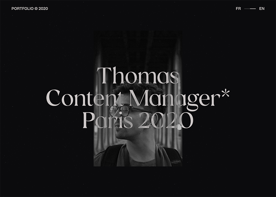
Thomas Bosc | Content Manager
ChatGPT & Beyond: A Next-Gen Wave in Personalized UX/UI Design
Illustration by Joana RicardoIn the realm of digital design, generative AI emerges as a transformative force, poised to revolutionized the way UX/UI designers craft exceptional user experiences. This remarkable tool, with its autonomous content generation capabilities, holds the promise of automating repetitive tasks, fostering creative co-creation, and unlocking personalized, adaptive, and dynamically evolving user interfaces. As generative AI continues to evolve, its impact on UX/UI design is poised to transcend boundaries, shaping the future of digital interactions in profound ways.AI’s Influence on UI ParadigmsIn the ever-evolving landscape of UX/UI design, the convergence of artificial intelligence (AI) brings forth a multitude of challenges and opportunities. This discourse isn’t about AI replacing design tools; it’s an exploration of AI’s substantial impact on UX/UI design. Our task as designers is to uncover effective strategies for harnessing AI’s potential to craft engaging and user-centric digital experiences.Jacob Nielsen’s prophetic vision foresees a future where AI significantly shapes user interfaces. This impending transformation prompts a comprehensive revaluation of the UI paradigms that have underpinned design for decades.Understanding the evolution of these paradigms offers invaluable insights. Let’s revisit the historical progression. Nielsen’s quote underscores a pivotal shift: “ User interfaces will be imbued with more AI than ever before”. This compositional change inherently alters the roles of UX professionals. To comprehend this shift holistically, it’s crucial to trace the trajectory of UI paradigms.The first paradigm traces back to the era of batch processing. Specifications were handed to computers, and outcomes were produced after extensive processing periods.Image via effectrodeThe second paradigm, which reigns supreme today, revolves around command-based interaction. Users initiate actions, manipulate outputs, and iteratively steer towards desired outcomes.Photo by freestocks on UnsplashHowever, the advent of AI introduces a paradigm that transcends mere command-based interactions. Enter the third paradigm: intent and outcome-based interactions. This paradigm is exemplified by contemporary AI-driven tools, particularly evident in image generation. Consider the AI-driven image creation process, where the DALL-E-inspired design philosophy reigns supreme. This approach pivots from a command-driven structure to a more conversational interface. An essential feature of this new interface mindset is the introduction of a prompt at the core of the input. Herein lies the transformation — a shift in the user’s role.No longer are users instructed step-by-step; instead, they articulate the desired outcome. This marks the emergence of the intent-based outcome specification — the third UI paradigm.AI & Machine Learning Will Change UX Research & Design (Video)Exploring third paradigmTo delve into the third paradigm in our current landscape, let’s examine a prime example: ChatGPT. With the public release of ChatGPT, a new era of content generation and interaction has emerged. While the concept of chatbots and digital assistants isn’t novel, what sets ChatGPT apart is its ability to deliver more personalized and higher-quality responses to user queries. This remarkable capability has spurred numerous platforms to seize the opportunity and integrate generative AI features.However, a prevalent issue among these applications lies in the flawed input methods employed. As we’ve previously discussed, the third paradigm emphasizes intent and outcome expectations. Yet, current applications predominantly utilize a chat box method for input with AI systems. Consider the recent feature of the Bunq app, introducing Finn, an AI assistant within a banking app. While Finn claims to assist with recognizing spending patterns and budgeting, it appears constrained by the chat box interaction method.Finn promotionl material from Bunq.For instance, the feature could enhance user experience by integrating financial projections directly into the app, rather than relying solely on user queries. The chatbot design, by confining itself to a specific interaction method, limits the potential of generative AI models in elevating individual aspects of an application.Another illustrative example involves the use of generative AI in media. AI models have been leveraged to create images and videos, revealing a friction between intent and generated results. Experimenting with these models highlights the significance of context clues and knowledge in our daily lives.For instance, when I asked Microsoft Bing to generate images of a Star Wars-inspired café, the initial results fell short of my expectations.Initial Results from first promptWith additional iterations and contextual information, the AI eventually produced results that aligned more closely with my preferences. Below I have shown some of the examples that comes closer to what I wanted when I gave the initial prompt.Final results gathered from multiple prompt iterationsThis scenario in my opinion is a glowing example of constraints of chat box style of interaction method and struggle with third dilemma within the design space for generative AI currently. The first set of images generated serves as a good result of prompt I had given but it fails to consider my personal knowledge set and preferences.I as a user have no understanding of the what toolsets the AI will be using and its understanding of its my current preferences and needs. I would be in need for a retro vibe today but in a years times, my preference can change and become a new standard. This creates a scenario where as my knowledge set and preferences changes but the initial query I had will be same with different expected results. Since the input method creates an expectation of receiving the result envisioned by user, this interaction can ultimately lead to feeling of disappointed form the interaction carried out.One way to mitigate this problem of AI’s understanding of knowledge set of user, is to allow them to give custom data to AI so they can adapt to the user preferences. OpenAI to recently added custom data set for the ChatGPT so it can have a base level of understanding from a custom data set but it still is limited with the level of understanding provided from it. It also brings the issue related to the preferences in data sets that AI has been trained on creating preferences for certain data. In the next section we will discuss some ways that can help with challenging the paradigm.Rethinking AI InteractionAdobe has been exploring various methods to assist designers in generating content within their Creative Cloud applications. Their approach in Photoshop involves an additional layer of interaction before the text input box, allowing users to select a specific area and instruct the AI to generate content within those boundaries, taking into account the existing image content and adapting to the prompt provided.Adobe photoshop showcasing the generative fill feature. Image form AdobeThis selection menu serves two purposes: it focuses the AI’s attention on a particular section of the image, providing more context, and it guides users towards achieving more specific results.These efforts echo similar AI integration challenges we’ve encountered in the past. Google Lens, an AI-powered tool that identifies objects and text in the real world, comes to mind. Adrian Zumbrunnen, in a compelling presentation on context-based interfaces and AI, addressed the difficulty in keeping users engaged while the camera scans and processes the surrounding environment. He explained that a lack of visual feedback can make the process feel unresponsive and confusing.Visual lookup feature showing the white dots around objects being scanned. image from GoogleZumbrunnen’s solution was to introduce an animation that visualizes the AI’s object identification process, providing users with a clear understanding of what’s happening behind the scenes. This visual feedback fosters engagement and encourages users to interact more actively with the AI tool. We can try to bridge the gap with some of the lessons we have learned currency to bring more context to the interface for AI. This exercise highlights the importance of considering input methods and user intent when designing AI interfaces.https://medium.com/media/c1bf8c2d9d53d69109e9d57f16c57cab/hrefWe can draw inspiration from Spark AI, which enables users to prompt the AI to assist in composing emails. While the implementation still encourages an iterative approach and introduces some ambiguity, it partially addresses this by providing options for proofreading, response length, and tone. These defined context points help users anticipate the outcome with greater clarity.Spark AI feature list, Image via SparkGoogle Duet AI, which recently debuted, offers similar features for word processing applications. However, it still faces the challenge of understanding contextual nuances. For instance, when selecting the option “make text sound more casual,” individual users may have varying interpretations of “casual.” This lack of shared understanding can limit the usefulness of these features. One potential solution is to provide more explicit descriptions for each option, clarifying their intended effect and the range of potential outcomes.A more ambitious approach involves introducing visual representations of the AI’s decision-making process. Seeing the AI “work” (represented visually) can enhance understanding and provide users with a greater sense of control over the AI’s actions. Animations showcasing image generation or text creation after a prompt is provided can effectively convey the AI’s workings and foster trust in its capabilities.As Zumbrunnen’s research suggests, without proper animations, automation and AI can be perceived as less responsive. His studies indicate that users generally prefer animations over instant results, as they provide a glimpse into the underlying processes.Current AI implementations often fall short in this regard, as the AI’s decision-making process often involves multiple steps. When users lack insights into these decisions and how they can influence them, the interaction becomes a guessing game. This lack of transparency can lead to disappointment and uncertainty in the UX.Apple Visual lookup feature showing contextual information form the images. Image via AppleApple’s approach to AI integration offers valuable lessons. Their Photos app has been regularly updated with useful features like plant identification and laundry instructions. Apple calls this feature “Visual Lookup,” and it seamlessly identifies specific objects in photos, such as animals, plants, and landmarks, providing relevant context information.In contrast to current AI interactions that rely on chat boxes, Visual Lookup is integrated directly into the Photos app, without the need for explicit user input. The AI’s findings are presented within the app’s “Info” section, accompanied by clear explanations of the identified objects and their significance. This approach makes it easy for users to understand how the AI arrived at its conclusions and fosters trust in its capabilities.ConclusionBridging the gap between users and AI requires a multi-pronged approach that combines clear input methods, visual representations of AI processes, and seamless integration into existing workflows. By adopting these strategies, we can create AI interfaces that are more intuitive, engaging, and responsive, ultimately enhancing the overall user experience.ChatGPT & Beyond: A Next-Gen Wave in Personalized UX/UI Design was originally published in Muzli - Design Inspiration on Medium, where people are continuing the conversation by highlighting and responding to this story.
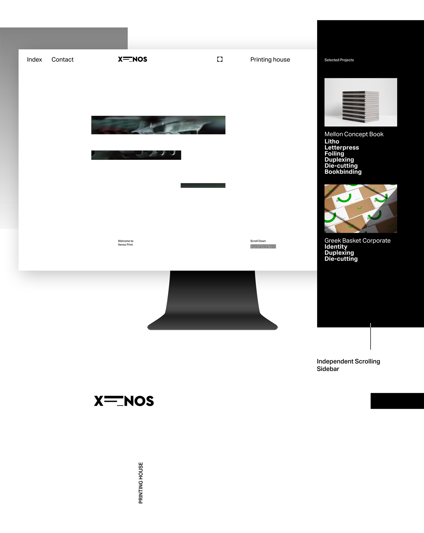
Xenos Printing House UI
The Death of User Interfaces
Dive into how product design has shifted towards a UI focus and how the AI “revolution” is gradually phasing out the “traditional user interfaces.”Hello, friends 👋It’s been a while, but life hasn’t been easy lately. Lots of work, thankfully 🙏This time, I’m discussing how I feel our beloved field of product design is changing and where it might be heading. To be clear, these are just my opinions, and I could be wrong (I most likely am), so please take them with a grain of salt. I’m no expert in futurology, and I wouldn’t stake my life on any predictions I’ll make below. However, I found thinking about it exciting, and honestly, it has been enjoyable pondering over it. So, I guess I just want to share these thoughts!Shall we begin?The Death of “Traditional” User InterfacesLife was simpler before “blinking RGB bordered buttons”… I remember when I started working on what I didn’t realize was product design. It was about 8 years ago when I launched my first startup, EzyCities. It was essentially a platform for booking experiences, similar to Airbnb Experiences, which, incidentally, edged us out of the market. Back then, I had to design the entire platform, both web and apps, all by myself 🤯. I started with Illustrator because it was easier for me at the time. Sketch was somewhat “new,” and Figma, although it already existed, wasn’t on my radar.Looking back, my job focused more on how people could quickly create and purchase experiences rather than on the app’s appearance or its components.I get the impression that product design was more concerned with the user experience and conversion rates than aesthetics, but maybe I’m mistaken. Don’t misunderstand; aesthetics have always been crucial for attracting users to a product, but I firmly believe they weren’t the top priority. Consider the major players back then, like eBay, Amazon, or Craigslist. Their focus was on making it fast and easy for users to perform actions on their websites, with less emphasis on minimalism, animations, and sleek components.It seems to me that a lot has changed in the last 8 years. We’ve reached a point where, sometimes, appearance matters more than functionality. This shift may be partly due to the increase in digital product offerings and some markets becoming saturated. However, I also attribute it to today’s “show-off” culture. Nowadays, it appears the shinier a product is, the more attention it garners, regardless of its functionality. Designers seek content for their social media, so a button with RGB blinking border animations gets more likes.Re-reading this, I sound like an old grumpy man lamenting the new era — I’m not (though I do have the back pain to match).Before you joke about my grey hairs, let me clarify: I appreciate a well-executed micro-interaction. What irks me are the “macro interactions” (have I just coined a term?).Have you ever visited a site or landing page where everything moves? It’s overwhelming, like a carnival without the food — the fun part. It makes me dizzy — and I assure you, I’m not that old.But let’s get back on track. I’m not saying animations or interactions are inherently bad; it’s just that we might be overdoing it a bit.Yet, I don’t believe designers are solely to blame. Users also play a role, as they now prioritize aesthetics over functionality. I’ve had friends tell me they signed up for services simply because they looked cool. While this underscores the value of design — we create cool things — it also highlights a part of our job that involves simplifying things and making users’ lives easier.The End of User InterfacesWhat a headline, right? It’s not entirely accurate, but I liked how it sounded, so it stayed.Let me explain…Lately, I’ve noticed a trend in digital products aiming to “erase boring internet tasks.” Software and apps like Arch Search and another one I can’t remember right now are designed to search the internet for you or perform tasks on websites using AI.For instance, Arc Search (the creators of that cool Arc browser) recently launched what they call a “Google competitor” (if such a thing truly exists), with the promise to “Find Everything, Faster.” Their software lets you enter a question or keywords, and it navigates and reads the top 3 or 4 search results using AI. Then, it creates a simple, text-based “site” summarizing information from those sources.Arc Search for iOSAnother software doing something similar is MultiOn, a new AI start-up that promises to “make daily tasks quicker and easier”. It basically does things for you in your browser, like booking cabs or getting groceries, so you don’t have to. You just tell MultiOn what you need by giving it a prompt, and it bypasses all the page's UI to do those tasks with little to no interaction needed from your side. You can watch how MultiOn works in this video.This shift towards functionality over form raises questions about the future role of UI design. If trends continue in this direction (which I could bet an arm it will), we might see a landscape where the aesthetic elements of a website become secondary to how efficiently a task can be performed. This doesn’t mean the end of UI design but rather a transformation. UI designers might need to adapt by focusing more on creating interfaces that integrate seamlessly with AI technologies, ensuring that the user experience is not just for users but also machines (and web crawlers).Imagine a future where UI design is not about the most eye-catching button or the slickest transition but about creating an ecosystem where AI and design work hand in hand to provide users with what they need before they even know they need it. The challenge for designers will be to innovate within these constraints, finding new ways to make the interface engaging and intuitive without relying solely on visual appeal.You might be wondering (as I was): What about the UI for these UI “killer” tools? Well, they would be among the last to shake up the UI world in the apocalyptic scenario of UI’s end — okay, I’m being a bit dramatic. But, returning to reality, if the AI revolution has taught us one thing, it’s how to achieve greatness without relying on complex or flashy UI designs. Consider these two examples from the leading AI innovators out there:ChatGPT: It’s essentially just a chat interface with a few buttons, nothing flashy, and almost no animations. Even their landing page is remarkably straightforward. Additionally, creating your own “version” of ChatGPT is done through the chat interface — no special UI for it.MidJourney: These guys embraced a minimalist approach to UI by not having one in the traditional sense. They use a third-party UI (Discord) to run their software. Even though they have millions of users and generate millions of dollars.Just want to highlight that both these platforms have gained immense popularity without depending on fancy visual effects like border gradients on their elements. Instead, they prioritize simplifying the user’s experience, saving them the hassle of navigating websites, using different software, or clicking through numerous buttons and links — emphasizing more UX than UI.So, while the provocative title ‘The End of UI’ might not be entirely accurate, it was meant to highlight a significant shift in our approach to and interaction with digital products. It might not mean that UI is dead, but that our concept and interaction with digital products are about to change.That’s not all…If you thought that this was “bad enough” for UI designers, wait until I tell you about Humane AI Pin and Rabbit R1…These aren’t characters from Star Wars but rather hardware and software that aim to eliminate your interaction with the “traditional UI”. Think of voice-activated devices that let you interact with websites, and APIs, read images, “click” buttons, “fill in” forms, and complete tasks. Yes, they can do all these things and probably more. It’s like if Alexa and Siri took AI steroids!To give you a better idea of what I’m talking about, let me quickly explain (or try) what both these pieces of hardware (and software, of course) do.Starting with Humane AI Pin: Released on Nov. 9th, this gadget envisioned by two former Apple execs is a visionary gadget aiming for a screen-free future. It’s a small device that clips onto your clothes and acts as a voice-activated assistant using AI. It can handle tasks like answering questions, making calls, and sending texts. It features a camera for recognizing items and providing information, a “Trust Light” for privacy awareness, and a mini projector for displaying visuals on your hand.Credit: HumaneYou can learn everything about it on the Humane website, or in this cool article about it.Rabbit R1 (my personal favorite), on the other hand, has more resemblances with a phone (even though it isn’t a phone), meaning that it will probably also have more “early adopters” (check my article on familiarity biases to understand why). It is a fun-sized, smart orange, and beautiful box (designed by the cool folks of Teenage Engineering) that wants to simplify how you use apps with the help of AI. It’s not a phone (they need to make this clear), but a personal assistant that fits in your hand. Instead of swiping and tapping on apps, you talk to it to get things done — like ordering pizza or playing music on Spotify, using a special AI to learn how to do tasks by itself. Plus, it can even make phone calls (not a phone).If you got as excited by it as I did, check out their website or watch their video presentation on CES 2024.So, now that you know about this, you can start worrying (I’m joking of course).What’s left for UI/UX designers?If you ask me to look into the future, I’d say the world of product design is about to see some big changes, but it’s not going anywhere. UI design, too, isn’t going away anytime soon. However, what we as designers focus on is going to shift. We’re going to spend more time thinking about how people interact with the data and features in our apps, rather than just making sure everything looks pretty.We’re also going to need to learn new skills or get better at things like voice control, sound effects, and haptics, which are all about how things feel when you touch them. It’s about looking beyond just the screen and buttons and thinking more about the whole experience someone has when they use our products. Plus, we’ll need to find creative ways to make our products stand out and be easy to use without just adding more visuals like flashy buttons, fancy fonts, and bright colors.Another big thing is that we have to design not only for people but also for computers and AI. This means we have to make our websites and apps easy for AI to use too, with writing that’s clear, links that make sense, and information that’s easy to find and understand.For someone who loves to learn and try new things, like me, all these changes in product design are pretty exciting. I’ve seen a lot of change since I started working in this field, and this is just another new challenge. The best part is, that product designers are good at adapting to new things, so I’m confident we’ll all do just fine with whatever comes our way.So, there you have it. Product design is changing, and we’ve got to change with it. We’re going to learn new stuff and think differently about how we design. But I’m excited, and you should be too. It’s a chance for us to do some cool things.I’m curious about what you think. How do you see the future of UI? Drop your thoughts in the comments.If you liked this article, please give it a clap 👏. It helps more people find it, and don’t forget to follow me here, X (Twitter), and LinkedIn. You’ll be the first to know when I post something new, and check my work (outside writing). You can also throw in some ideas for articles or just talk about design and products with me.Catch you later 👋The Death of User Interfaces was originally published in Muzli - Design Inspiration on Medium, where people are continuing the conversation by highlighting and responding to this story.
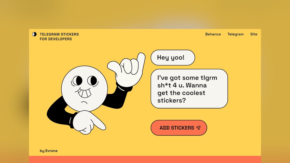
Website Inspiration: Telegram stickers for developers
Fun Landing Page with a (fittingly) conversational approach promoting a cheeky Telegram sticker pack for developers by Evrone. Full Review
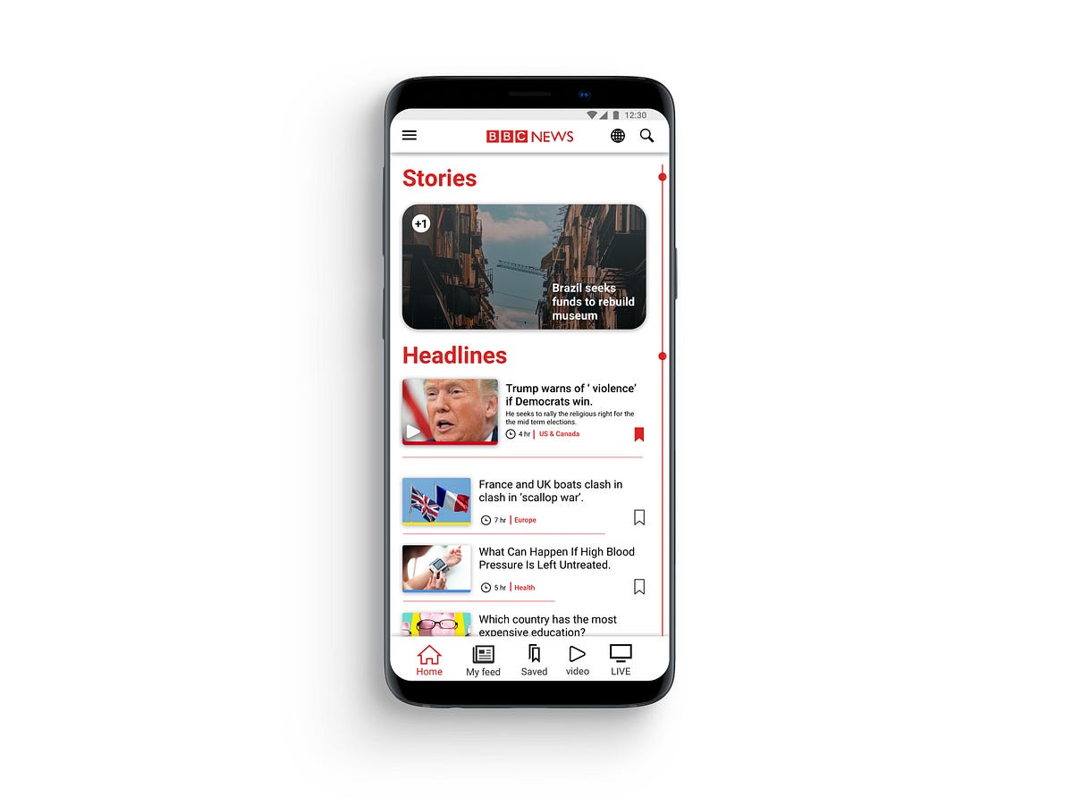
UX case study — BBC NEWS app android
UX case study — BBC NEWS app androidRecently I was searching for a news app which could pull news from around the globe. After stumbling upon BBC news app, which has over 10,000,000 downloads on play store. I thought, an app with this massive following should reward its users with a rich user-experience but BBC news app in its current state is strung together by some good ideas but heroically falls through on execution of these ideas.Problem and hypothesisReviewing other BBC apps in an attempt to understand the brand ideology and content representation across different platform, I found inconsistencies between their applications which is mostly caused due to conflicts in design guidelines provided by different organisations.I Hypothesised that by changing the user navigation flow and striking a middle ground for design standards, will give developers less headache while developing application while providing a more optimised and rewarding experience for the users.BBC android app.PersonaMy goal was to persuade a new user to use the app and turn him into a regular user. I envisioned a user persona who can be a potential user but avoided a specific user who will be a perfect candidate for their app or one who can be considered their core user.Job Story & ScenarioMy decision to choose job story over the user story was that user story has too many assumptions and doesn’t acknowledge causality. When a task is put in the format of a user story ( As a [type of user], I want [some action], so that [outcome] ) there’s no room to ask ‘why’ — you’re essentially locked into a particular sequence with no context. In contrast, Job story provides as much context as possible and focus on motivation instead of just implementation.framing design problem in a Job, focusing on the triggering event or situation, the motivation and goal, and the intended outcome.Guerrilla Usability TestingFor solidifying my hypothesis and to gather more data on the app from a user perspective. A small test group was given instructions to use the app for a span of three weeks. After three weeks I collected their verdict and overall experience. After analysing the data I found some interesting insight, Most of the users forgot to use the app after a while and didn’t feel motivated to use the app. The poorly executed navigation system was the major reason that the users felt lost and eventually lead to abandoning the app entirely.Identifying and Prioritising Pain PointsFor producing an optimal flow, I had to study and point out what is the pain point in the app. For finding pain points and organising the feedback in one place to get a view for the analysis of all data in one place I utilised affinity mapping.affinity mappingI collected data from the test group and my personal notes in the yellow sticky notes. All the feedback is gathered and arranged in the crude sections which make abstract sections/feature of the app. Blue notes represent a clear idea from all the input received from yellow notes. It helps to make note of all the useful feedback and combine it into smaller chunks for later inspection as we go from the bottom-up process. Each hierarchy represents a clear idea for the development of the feature in understanding the user needs and goal for the app set by the company. Doing this activity helped me to sort through all the comments to get a clear view of what is important for the user while satisfying business goals.Prototype and validationAfter getting a fair idea of what elements should be improved or gotten rid of completely. With help of affinity mapping, I was able to stay on track while experimenting with user flows and improving current UI design elements to fit standards proposed by Apple and Google. I took feedback on the design from my peers and tried to integrate their feedback in the design.1. finalising general layout and navigation bat .2.prototype for the index. 3. variation for stories.4. wire-framing different layout. 5. testing layout for article sectionAfter spending time with wire-framing, I moved to work on sketch to test the idea with much more fidelity. After getting an idea of the app will look in the static images I started to design HI-FI prototype in Invison.you can see and interact with the prototype here.Implementation#1 HomepageCurrent app does a poor job of delivering the content in an intuitive way. It depends on app bar for its navigation, using an app bar for navigation seems clunky and stale. It gets messy very quickly as you have to sort through myriad tabs to reach the desired topic.‘Home’ has to be the home screen of the app so it had to be welcoming and informative. To fulfil that goal I cleaned the UI and made changes to how categories are organised on the home screen, in original design spacing between the article were too tight as it resulted in an unpleasant experience where the user feels confined. Instead of just increasing the spacing, I opted for changing the layout. The Most popular article from each topic has the prominent exhibition in the section of that topic, thus headline of each section draws more attention. Each article has been marked with a tag from where the story belongs. The thumbnail of the story has a band beneath it to indicate its tag by colour. These colour tags are used in the BBC website to distinguish all the content quickly.#1.5 StoriesThe story is the distinguishing feature of the BBC app, But it was hard to locate in the original design. It just needed to be in the spotlight. To fulfil the requirement I put the story on the top section from where every user can see it in the prime spot. It could become a quick way to consume news as it is video-based content delivery in a short period of time. Having an indicator which notifies the user of new stories to make the stories more central element of the app and set apart it from its competition.#2 Navigation barAs I wanted a cohesion between android and Ios version of the app, Navigation should feel same and intuitive rather than just scrolling through tabs. Using a nav bar is the logical solution, as both apple and google support it in their guidelines. Removing the app bar navigation allowed me to allocate more space to the main activity. The navigation bar is divided in 5 section Home | My feed | saved | video | LIVE . Each section is the main feature of the app and now it is in front and centre of the app always at the user’s fingertips.#3 New navigation flowThe user still has to traverse through a myriad of topics, making navigation a painful and tiresome process. I resolved it by implementing a new system for navigation called ‘Index’. In ‘Home’ and ‘My feed‘ there is a line on the right edge of the screen. The index acts as a signifier instead of being an affordance for the user which can be triggered by tapping on it. The user will be carried to an index page where he could rifle through topics which are arranged in a linear manner. the index page gives an alternative, instead of scrolling in the home screen to get to a topic he can achieve the same result in less time. There is an indication on the left side to apprise the user of how many new articles had been affixed to the topics since the last session. The index is a more practical way to access the topics without cluttering the main screen with tabs.#4 My feedSetting up my feed was a very tedious task in the original design. My feed is a great feature of the app, I modified the interface which can bring some colour and playfulness to this screen but won’t distract the user. As you select the topics it provides more relative topics.In Old design traversing through tabs took longer than it needed, every choice that you have selected from my feed will be added to the main navigation. After a while main navigation feels like a dumping ground, I start to lose its purpose.The user gets confused and lost his way around the app quickly which cause the user to select few choices in order to keep the navigation clean.To overcome this obstacle, in my new design ‘My feed’ is similar to the home but has curated content where the home was meant to be more of a general place, My feed has the much tighter layout and packs more topics than home. It has a simple layout without making it difficult for the user to navigate to their favourite topics quickly using Index which is separate from the ‘Home’ section topics.Now there is a clear distinction between the two section and navigation for the two section.#5 Reading an articleReading an article is the most important thing in a news app. I chose a layout which will conserve the integrity of reading. The font weight is varied from the title to the main body to demonstrate different heading. Accessibility features are placed in the app bar for ease of reach. Share and save is led at bottom of the cover image which is most used feature while reading the article.SummaryJust by changing the layout and cleaning up the design to new standards of material design, makes the app more approachable and put the content that matter to the user and business to front-line without compromising anyone’s goals. The new navigation system can be a time saver when the user wants to reach to a topic very quickly. The changes made to the ‘My Feed’ are substantial and encourage the user to interact with it. After getting feedback from the same test group. They were impressed by the improvement in the experience from the proposed design for the BBC app.UX case study — BBC NEWS app android was originally published in Muzli - Design Inspiration on Medium, where people are continuing the conversation by highlighting and responding to this story.
Pattern Library First: An Approach For Managing CSS

Weekly Designers Update #530
Your weekly dose of design inspiration, featuring the hottest projects, must-have tools, and game-changing products.Want a daily boost of creative energy? Install the Muzli extension,your nonstop source for design inspiration, right in your browser! 🚀🏆 Muzli Community UploadsWant to get featured? Upload your work to Muzli.meTweet by Slavaby Kornilov SlavaAI Board Work Tasks🔗 View the project.Animal Futuresby Unseen StudioExplore five immersive worlds, each showing a different future for animals, and learn how your choices impact their well-being.🔗 View the project.Brand Design for an AI-Driven Learning Platformby ZajnoWhile working on the visual identity for Gentle Rain, we drew inspiration from the early days of technology and entertainment — when hip hop, the movie industry, and personal computing were just emerging on the U.S. West Coast…🔗 View the project.Hand-Thrown Stonewareby Quang PhanA study of clay, light, and balance — translated into pixels. Inspired by Hanoia, this concept celebrates the quiet beauty of handcrafted stoneware.🔗 View the project.🔥 Must-See Design PicksOusmane Dembélé — Ballon d’Orby Flot Noir ™ ⏤ StudioOusmane Dembélé, from the streets to legend. A digital & immersive experience celebrating his Ballon d’Or under the colors of PSG….🔗 View the project.Michaël Bernardby Michael BernardDesigner passionné par la création d’expériences digitales sur-mesure, j’adopte une approche centrée sur l’émotion pour concevoir des projets sincères et authentiques.🔗 View the project.VAP — Video Production Studioby Studio 9PVideo post-production for brands & influencers: VAP creates impactful, original, and memorable content. Cam ON, it’s time to .mov your stories.🔗 View the project.Morphon Iconsby JAVIERMorphon Icons is a full revamp of one of my favorite icon sets, originally designed in 2017. This personal project reimagines that old work through a refreshing modern lens, introducing soft neumorphic styling, smooth motion baselines, and practical demo cases, all optimized for community use and open remixing.🔗 View the project.✨ Muzli Me — Creator SpotlightZajno Digital Design Studio is a creative digital studio known for crafting striking and memorable experiences across web, motion, and branding. Their work stands out for its refined aesthetics, strong storytelling, and attention to detail.🔗 Explore their work: https://me.muz.li/zajno.💡 New Tools & Assets for DesignersCanva UpdatesCanva introduced its biggest launch yet: the Creative Operating System, marking what it calls the Imagination Era. The update unites a redesigned Visual Suite, world-first design AI, and tools for scaling brands. Highlights include Video 2.0 for advanced editing, Canva Forms for interactive sites, Canva Grow for AI-powered marketing, and the integration of Affinity, now free for everyone. The new Canva Design Model brings editable, AI-generated designs that understand layout, hierarchy, and brand style.🔗 Explore this.Figma UpdatesAt Schema 2025, Figma introduced a new generation of design system tools built for the AI era. Highlights include Extended Collections for managing multi-brand systems, Slots for flexible component customization, and a faster design system engine with major performance gains. Figma also released an improved Code Connect UI, the MCP server for linking design and code, and Make kits that bring design systems directly into Figma Make. These updates push design systems toward smarter, living frameworks that evolve with AI-driven workflows.🔗 Explore this.Framer Halloween CampaignFramer hosted a fun virtual “Halloween Office Party” showcasing team members in creative AI-generated costumes, all displayed on a slick interactive gallery built with Framer. The project invited the community to join in by posting their own costume photos using the #FramerHalloweenParty hashtag, turning a simple holiday celebration into a visually engaging brand experience that highlights Framer’s design and web-building capabilities.🔗 Explore this….Ängelholm — Design & Brand GuidelinesModern Brand Guidelines Template🔗 Explore this.Zyra — Coded Chat AI DashboardModern AI chat dashboard built in React and Tailwind🔗 Explore this….Designers’ Secret SourceLooking for more daily inspiration?Download Muzli extension your go-to source for design inspiration!Get Muzli extension for freeWeekly Designers Update #530 was originally published in Muzli - Design Inspiration on Medium, where people are continuing the conversation by highlighting and responding to this story.
Building an adaptive favicon
UI Interactions of the week #196

Dating Apps: 6 UI/UX Design Tips for Modern-Day Cupids
Whether you admit it or not, our need to have a partner represents a fundamental instinct — the software created for us by Mother Nature. All of us are searching for a partner to march hand in hand into the future, complement each other, share the satisfaction, and enjoy life together.It’s also true that it’s hard for busy modern people to spend quality time searching for the right person. As a result, dating apps have become a necessary evil for millions. However, is it a real reason for creating dating apps?Technologies are changing the world. We’ve started communicating with them so naturally, that they impact our daily life in all its manifestations. And relationships aren’t the exception.The saturation of the dating app market. Get ready to struggleToday, millions of people meet each other online. As dating apps are increasing in demand, matchmaking mobile apps look like a promising business. However, the market is becoming saturated. From farmers-only dating apps to apps for people with the same musical tastes, there are millions of dating apps across the world. So, if you’re going to create one, prepare for competition.How to win a user’s heart with your dating app?Dating app developers and designers are the modern-day Cupids bringing love (short- and long-term) through their digital products to the entire generation. To build a dating app which is able to win a user’s heart you should keep abreast with what’s going on the market. Surely, to create a dating app you should follow the latest mobile app development trends. However, dating apps have some peculiarities. So without any further ado, let’s have a look at 6 tips that’ll help you build a dating app that’s fit for 2019.Build Empathy for the End-UsersYour tools aren’t only pixels and creative wit, but also a whole lot of empathy. As there is no universal rule on how to build relationships, the same can be said about dating app design. There can’t be a one-size-fits-all matching template or user experience design. All people are different.Dating app designers should have a deep understanding of the human psyche and mating models. To create a successful dating app design is not as easy as it may seem. You should virtually embody a user to tailor UI design able to interact with human feelings and emotions.Figure out the prototypical life situations to understand what kind of people are going to meet, why they decide to do this and how they agree on it. Your main mission is just to make this decision-making process easier for people.Tinder’s swipe left/right mechanics is a shining example of how people would like to behave in real life. You don’t know if someone has swiped left or not, so it’s not so stressful since you don’t have the fear to be rejected. And you don’t feel guilty too when rejecting someone. Instead, Tinder makes users feel good when they receive a match.Meet user’s expectations. Investigate how to match the right peopleNearly half of online daters are looking for someone they have something in common with. You can match people by interests or by things both of them hate. A shining example of this is the Hater app that helps meet people who ‘hate the same stuff.’ Badoo has a section where a user can look for their celebrity crush lookalike.Besides interests, there are also other matching options. For instance, Dine app has a very special matching style, integrating with Yelp. You can opt for three bars or restaurants and the app will offer you up to 5 matches who have chosen the same places today, so theoretically you can request to meet with a person right at this restaurant.Locali app offers a great solution for people who plan to travel to certain places. It founds matches around places you plan to visit.Give your users a feeling of safetyLet’s consider the Bumble app. It’s a great example of a women-friendly app. Here, women message first. Men have only 24 hours to answer after the match expires. There is also an option when one woman messages another woman. In this case, either party can respond first. However, you should consider some compromises, since not all men want to wait for the moment when somebody will message them first.Hinge app offers a wonderful solution for shy people who often don’t know how to start a conversation. Besides photos, users can include into their profile favorite food, two truths, and a lie or similar info tidbits. Such details help people to start the conversation by asking a question or commenting on something.This application has one more peculiarity — the two-tabbed interface that allows toggling between the chat and the profile. When chatting with someone you can come back to profile to check, for example, information about birth, dream vacation and so on.That’s not a secret, most of us aren’t honest in our profiles. Badoo app gives a great solution for it — a live video chat option for matched users. It helps to avoid stress caused by disappointment got when you meet a matched person in the real world.Pay special attention to a user profileSwipex app design by Fireart StudioA user profile should give enough information about a person and at the same time, it should be minimalist and not to overload a user with the long-filling forms. Do your best to make it intuitively understood.A user profile on Tinder seems minimalist, but does it really give enough information? On the contrary, Hinge app’s users should fill out long forms, but it allows to create a very detailed user profile. The best option is to keep a balance between Tinder’s minimalism and Hinge’s too detailed user information.Anyway, there are some core components that are obligatory on a dating app’s user profile such as photos, age, gender, interests, and other information that users might like to share.Design the messaging logic wiselyCredits to InVisionSo, you received a match. What will happen further? Communication, of course. Messenger is one of the most important things in the dating app’s UX and UI design. Design it wisely. You can use push notifications in order to prevent users from missing out on a possible romance. Another great option is smart real-time alerts about events within your application such as messages, matches, reminders, etc.Set the right mood with the color paletteIf your dating application promotes hot and passionate relationships, then consider red-color palette in your visual design.However, you can play on the safe side of happiness by using yellow colors like designers of Bumble app have done. BeLinked, an app connected to Linkedin, creates the mood of more serious relationships built on trust, thanks to a purple-red UI design. If you’d like to motivate your users to build efficient and long-term relationships, try to use the green palette.Final thoughtsInvest in the uniqueness of your dating app in order to get a chance to stand out of the crowd of Tinder’s clones.Dating app designer’s mission is very important in the modern-day world. According to The Economist, dating apps increase the rate of interracial marriage. One-sixth of all first marriages are via dating apps. And 70% of same-sex relationships start online.You can create a digital product that opens up a chance to feel pleasure, necessity, and even love. These aren’t just positive emotions. We’re talking about feelings that are fundamental for building a better future and raise our overall satisfaction from life.Dating Apps: 6 UI/UX Design Tips for Modern-Day Cupids was originally published in Muzli - Design Inspiration on Medium, where people are continuing the conversation by highlighting and responding to this story.
Dating Apps: 6 UI/UX Design Tips for Modern-Day Cupids
Get access to thousands of freshly updated design inspiration pieces by adding Muzli to your browser.
Loved by 750K designers worldwide, Muzli is the leading go-to browser extension for creative professionals.